Tips for Creating a Timeless Interior
We’ve probably all felt that pang of envy when we visit the homes of friends and neighbors and marvel at their seemingly effortless decorative style and taste. Some people seem to have a magic ability to spot classic combinations of color, texture, and lighting, while the rest of us can only manage chain store flat-pack furniture and off-the-rack designs. We want that timeless interior for our homes, but sometimes lack the know-how or confidence to create it.
This article is for those who need this confidence boost. Here we’ll show you how to create a timeless interior that will elevate you to the heady heights of style guru in no time at all by following our simple DIY tips.
Some Basic Rules
To come top of the design class, you need to follow some basic rules. First, never hide your personality in the finished design. Anyone can create a homogeneous look for their home, but with a little personal flair, like a splash of color or vibrancy to reflect your playful side, you can elevate your room to a new level.
Second, don’t be afraid to take risks. They may not always pay off, but when they do, you can create some real “wow” moments. Third, keep the basic principles of design in mind. Most designers work on the principles of harmony, balance, rhythm, proportion and scale, and emphasis to create that classic look, but mostly we’ve boiled it down to 3 simple elements that will uplift your interior space.
Create Mood
It’s widely accepted that rooms with bright colors and lighting often have a positive impact on mood and can improve depression and anxiety. On the flip-side, you can create an intimate atmosphere through the use of low lighting and subdued colors to create a sense of warmth and coziness that leave us feeling safe.
The best way to highlight the difference is the realm of the eating establishment. In fast food chains, there are often brash colors and intense brightness to encourage a cheery atmosphere and to encourage visitors to stay only briefly. In contrast, most high-end, fine dining establishments adopt a subdued, low-light environment that encourages intimacy and quiet conversation. They want you there for as long as possible, and again, research suggests that this formula works.
Create Storage
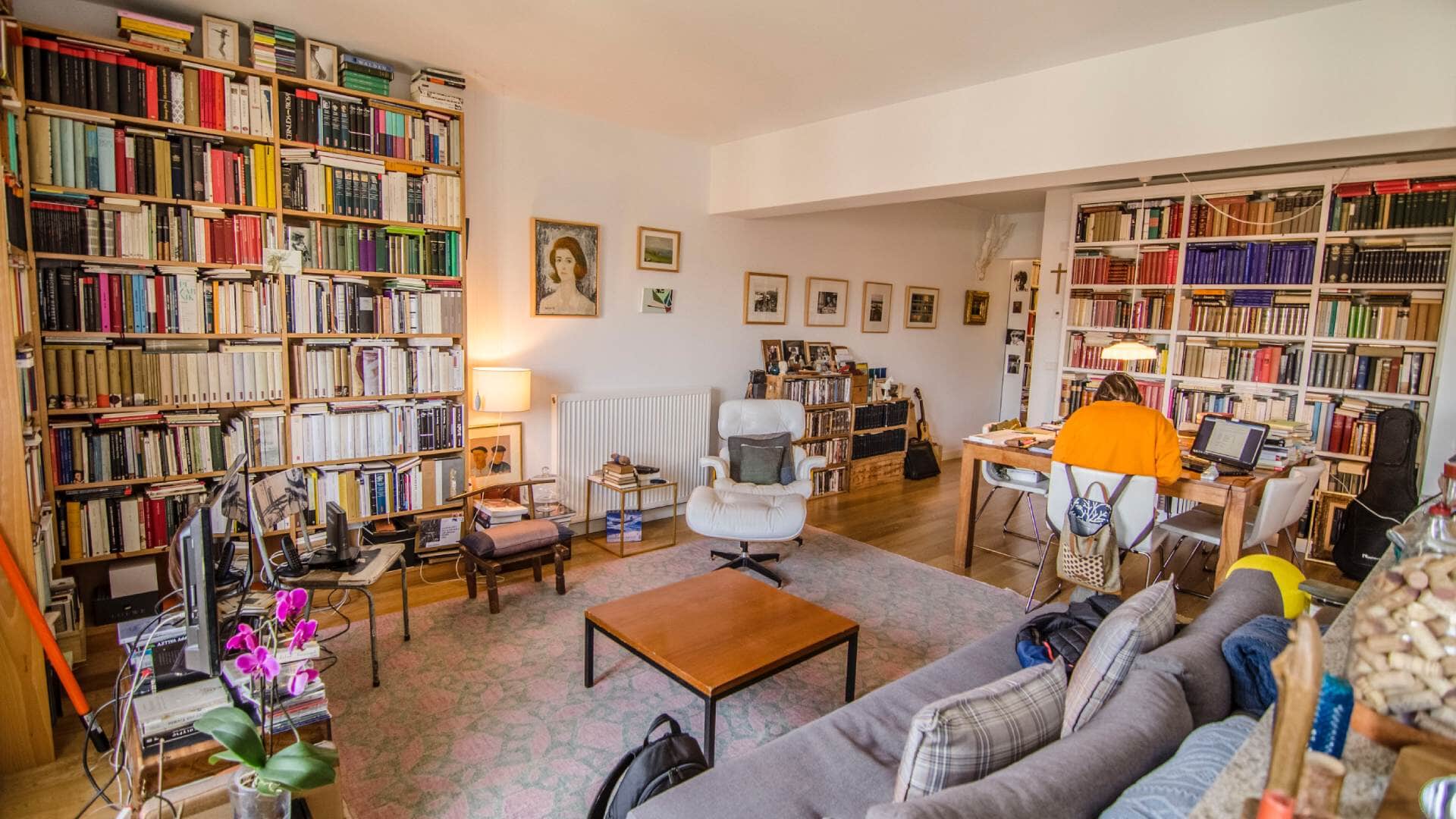
Behavior is self-perpetuating. If, for example, you live in a messy environment where things are strewn across the floor and sides, you are more likely to reflect what you see in your behavior. There is no incentive to be tidy when you see no value in it in the first place. By creating clever storage solutions, hiding away clutter encourages you to keep your space tidy, and it also helps others to do the same.
Storage, however, has to be practical too, because human behavior tells us that if it’s too much hassle, we’ll slip back into bad habits and the storage will remain untouched.
Create a Sense of Space
The eye is easily tricked, especially when it comes to the illusion of space. Just as bright light and color can influence our positive moods, small, enclosed spaces can make us feel trapped and overwhelmed. Creating the illusion of more space is crucial in design as we don’t all have the luxury of owning movie star mansions.
Light, shade, and line can all be used to build these sensation of more space. The flooring is one of the most critical features here: if you lay a wooden floor with the join lines running in a vertical fashion, you create an appearance of length that is ideal for shorter rooms. If, though, you lay the flooring so it crosses the space in a horizontal design, it convinces the eye that the room is wider than it is.
Timeless Design Tips
Create inviting spaces
Use soft furnishings, throws, and cushions to create a space that invites you to sink into the comfort and relax. Also, think about how you place your furniture: do you want to encourage interaction and conversation? If so, you can pair your sofas to face each other to enable guests to chat more comfortably.
There are some fantastic digital design tools that help you visualize the layout, and even how the furniture will look. Check out our podcast “Maximizing ROI and Selling Your Home” for top design tools tips and information.
Stick to neutral colors
White and other neutral colors don’t age so can keep your room looking timeless for a long time. This means that the room is a blank canvas, ready for you to add splashes of brilliance with accents of color when the mood strikes.
Neutral colors are also effective when decorating smaller rooms to give them a sense of space and light. Try an avoid dark colors as they tend to make the walls feel like they are squeezing inwards and narrowing the area.
Marry design with function
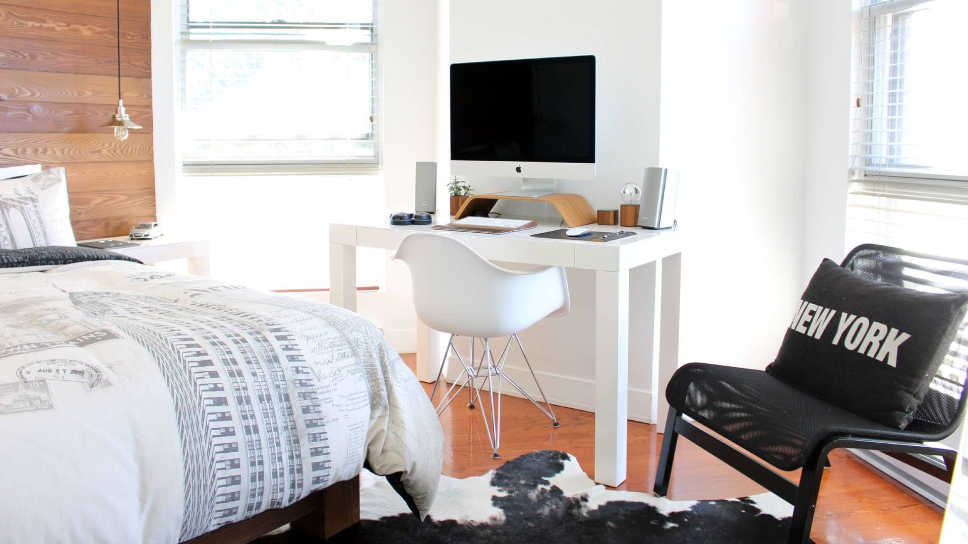
Things don’t just need to look good, they have to be functional too; otherwise, there’s no point having them. You should adopt that ethos when choosing the ideal interior accents for your home: a coffee table, for example, not only has to look its best, but can also double as a storage unit or maybe a magazine rack. It’s all too easy to fill up your rooms with pretty things, but unless they can also justify their place in your home they will over time become casualties of impracticality.
Spend wisely
We’re not advocating dropping big bucks on designer furniture, but it can be beneficial to think about your space and try to visualize one or two high-quality items. These splurges can make a powerful design statement that can then be supported by more affordable accoutrements. If you take your time and pick something that lifts the room, like some fabulous artwork for the walls, it will become a focal point as well as a topic of conversation for guests.
Upcycle
There is no shame in finding an old table or cabinet in a yard sale or bric-a-brac store. What’s more, taking that piece of furniture and getting creative with it is one of the most rewarding things you can do. Not only are you saving something that would otherwise end up in the landfill, but you are also saving a lot of money and giving it a new life as part of your new design scheme.
Keep it simple
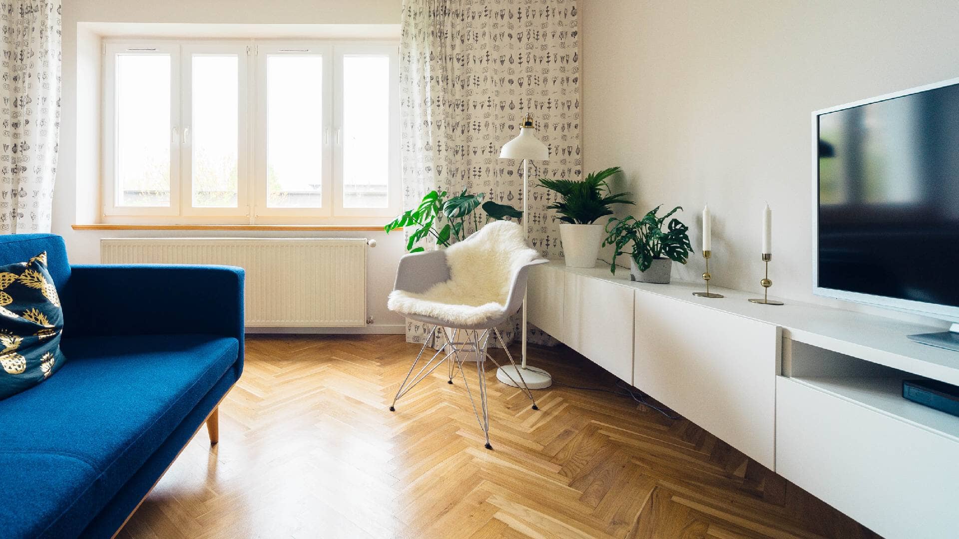
The simplest designs are also the best. Some of the greatest objects have been the most obvious design, yet they endure for many years. For some of the best examples of clean and simple design, look no further than the Bauhaus from the early 20th century. Their ideas are still being copied to this day because they produced elegant furniture that had the maximum functionality with the minimum of fuss.
Don’t ignore communal spaces
Often, the entrance hall gets overlooked in favor of the kitchen, dining room, or den, but the hallway is arguably one of the most critical space in the home as it’s where first impressions are formed by guests crossing your threshold. Give the hallway some love and attention to make an instant impact when receiving visitors.
Use patterns and textures to create a theme
Having a recurring pattern or texture can often bind the look of a room so that it holds all of the various design aspects together in a cohesive way. It provides a link between the competing elements that might otherwise look like a collection of things rather than a theme or style.
Use mirrors to reflect natural light
Often, mirrors are used in small rooms like bathrooms or dressing rooms to enhance natural light and to make the space feel airy. The clever use of reflective surfaces generally can aid in creating a light, spacious room that’s inviting. Mirrors are also handy for rooms with limited natural light because of the aspect, or the window size. If you have a basement apartment, for example, a couple of strategically placed mirrors will spread the light to its maximum and lift the gloom.
Mix old and new
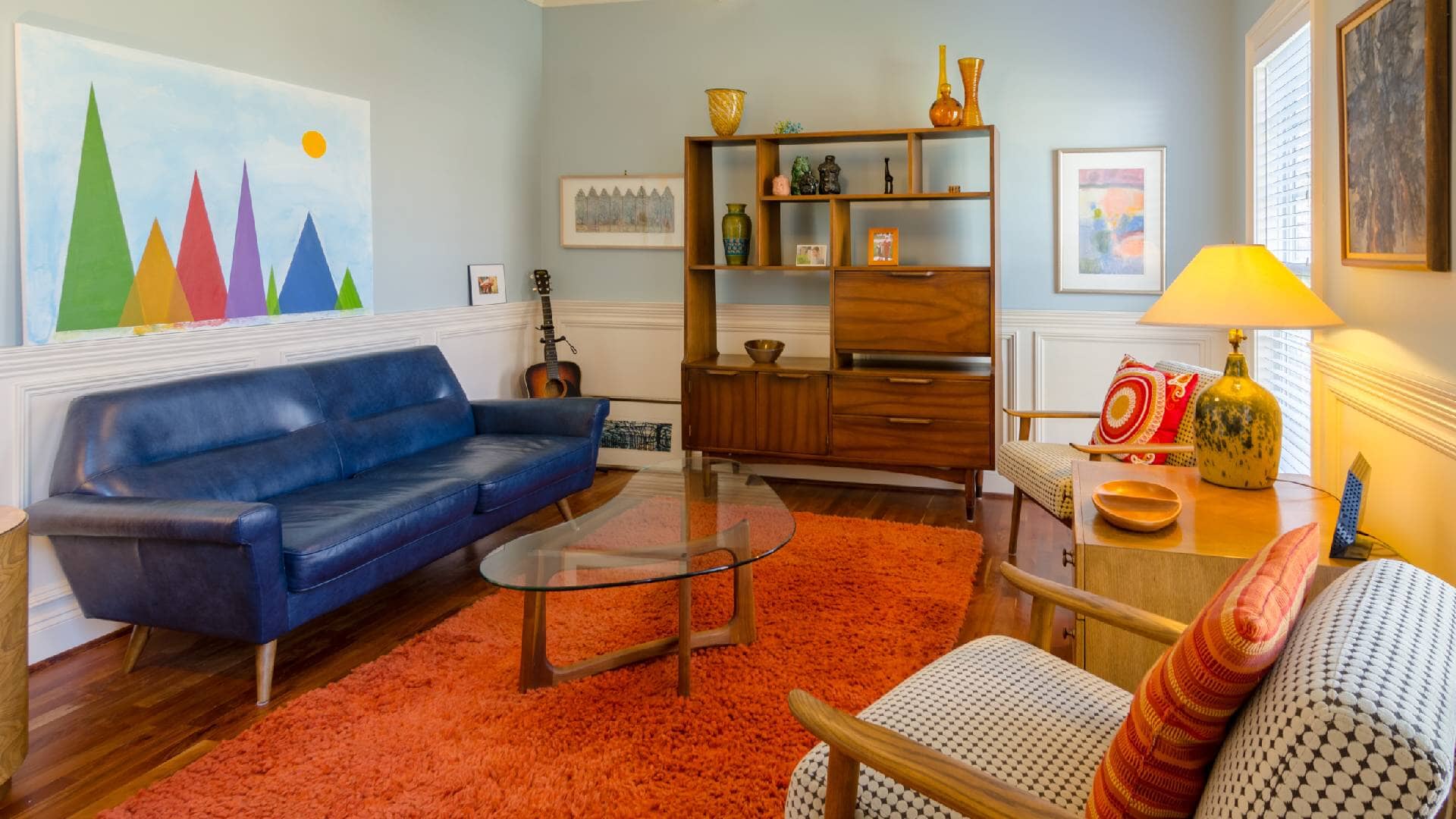
Try to avoid decorating entire rooms in one particular style to avoid the danger of a pastiche or themed room. It’s better to mix and match for greater flair and effect. Mixing antiques with modern objects complement the contrasting styles and enhance the features of both periods.
Trust your intuition
There is something within us all that tells us instinctively what we like and dislike. Similarly, when it comes to design, often a gut feeling is the best way to measure whether it’s a successful marriage of styles and objects. If something feels right, but you can’t put your finger on why, you can still go with it.
White kitchens never age
Much like neutral colors are timeless, white kitchens rarely go out of fashion in the same way as other styles. Who remembers that farmhouse design of the ‘80’s and ‘90’s? Dark oak cabinets might have looked stylish and modern at the time, but today nothing dates a kitchen faster than dark oak. Sticking to neutral shades, though, is a sure-fire winner.
Mix up materials
Creating contrasts with differing textures and reflective surfaces can conjure a bright and sumptuous look. A weathered wooden floor, with accents of color on the furnishings and a copper-topped coffee table, create a comfortable yet stylish look that creates an inviting space. We are tactile beings, so the use of varying textures increases our enjoyment of the spaces we live in.
Make the most of natural light
Nothing illuminates a room better than sunlight streaming through the window. Natural light is unique in the way it frames a space in shadows and texture. Think about the direction the room faces and then plan the design around it. Choose colors that complement the sunlight, reflecting its warmth, and then you can add accent colors that really make the room pop with personality.
Final Thoughts
Creating a timeless interior needn’t be a stressful thing, nor should you be fearful that you’ll mess it up. That’s the neat thing about DIY interior design: often you don’t know what will work until you have lived in the space, and inspiration can come from the most unusual places. The key here is trial and error, and to coin a famous quote from the Scottish King, Robert the Bruce, “If at first, you don’t succeed, try, try again.”

